


Key Features
Product Builder
What is LendAPI Product Builder?
LendAPI’s Product Builder is a no-code digital onboarding design studio. It is a powerful design tool that works with LendAPI’s decision engine, business management rules, LendAPI’s Workflow Orchestration platform as well as an out-of-the-box publishing system that can help you launch your new design within seconds.
LendAPI’s Product Builder Key Design Features
You can locate LendAPI’s Product Builder by signing up at app.lendapi.com/signup. And follow the instructions below:
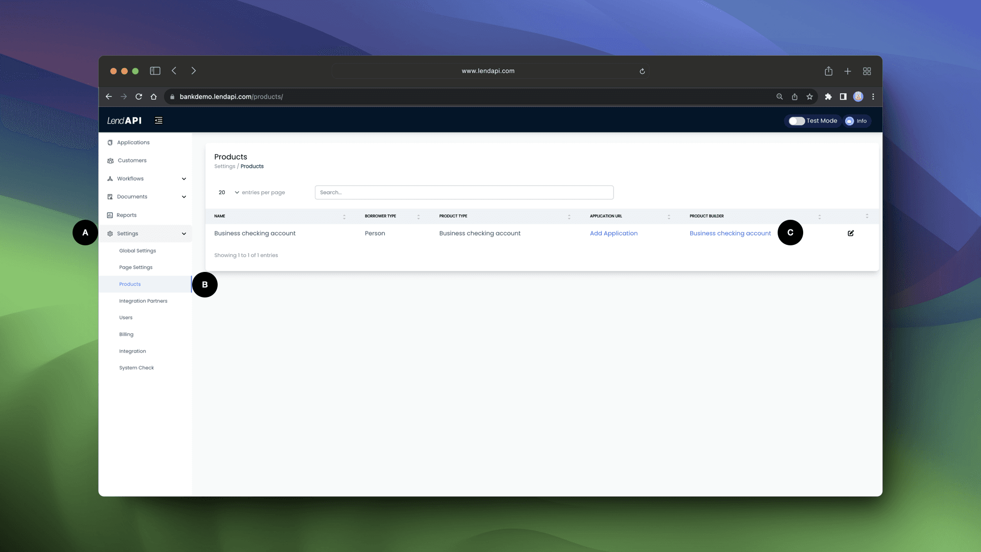
Getting to the Product Builder design studio:
Goto Settings
Click on Product
Click on the Product Builder Link. In this demo, “Business checking account”
Design Studio - Main Panels:
You will then enter LendAPI’s Product Builder studio template. In this demo, we’ve build a Business checking account and we will show you all of the features and functionalities of this the Product Builder studio
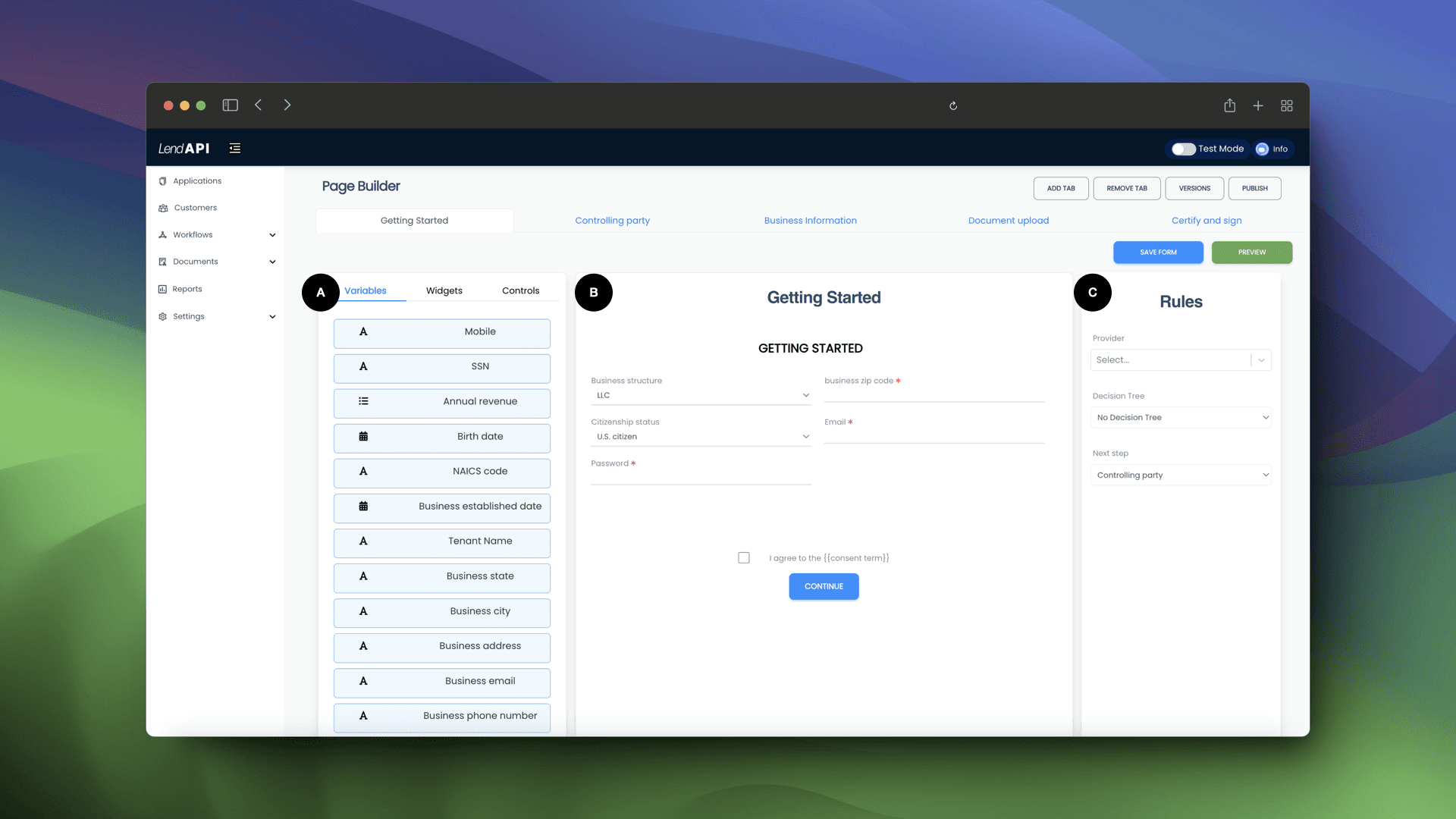
Design Elements Library: This library contains all of the variables from the variable library supplied by third party vendors, or designed by you the user. These fields can be dragged and dropped into the Design Canvas (B).
Design Canvas: Design canvas is a representation of what your end user sees and interacts with. In this canvas, you can collect fields from user input, ask the end user to upload documents and sign documents. You can also use pre-designed widgets to ask the end user to login to Plaid, Flinks etc.
Design Paths: In this section of the Product Builder, you can link which third party data providers to call as well as which decision tree you would like to execute.
Design Studio - Page/Tab Management:
Page Viewer: You can tab through or click through each page to design them and preview them.
Add/Remove Tab: You can add as many pages you think it will accomplish your digital onboarding goals. You can also remove tabs or pages as you wish.
Versions/Publish: One of the features of Product Builder is the ability to build multiple versions of your product and keep track of them all. As you collect feedback from your end users, you can add more pages, add more fields or take away fields or pages. You can then publish a new version and launch it right away. Any subsequent visitors to your website will start enjoying the new version of the application you just created.
Design Studio - Publishing your design
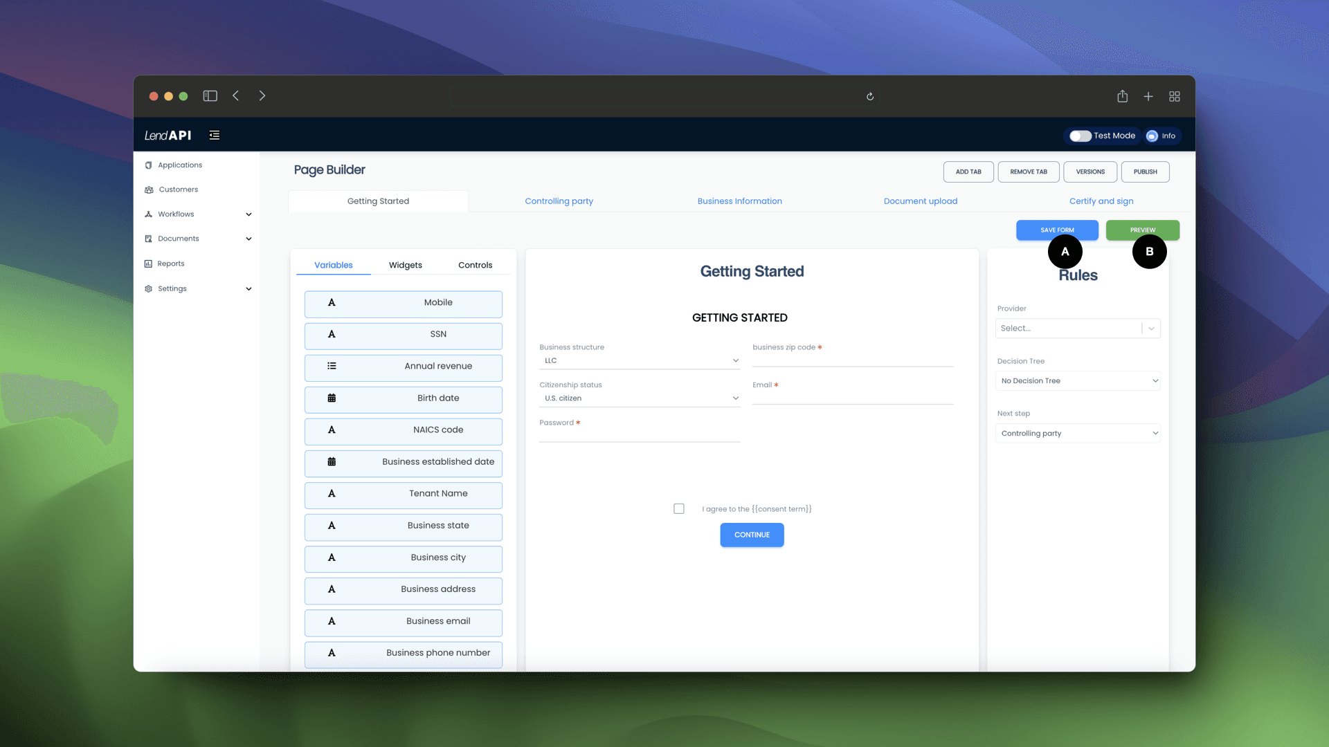
Save Form: Always save your work by clicking on Save Form. This will capture all of your latest changes before you move onto the next page.
Preview: If you want to preview your design and simulate what the end user sees, you can click on the Preview button and start filling out the form as if you are the end customer.
Product Builder Summary:
We are constantly bringing you new features and functionalities to help you design your own originations and link them with third party data providers as well as the decision trees you’ve developed. We encourage you to browse through other key features of this documentation center. As always, we are happy to help and please sign up at app.lendapi.com/signup and experience the Product Builder first hand free for 30 days.

